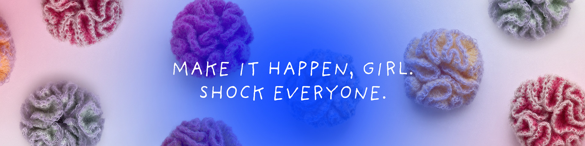
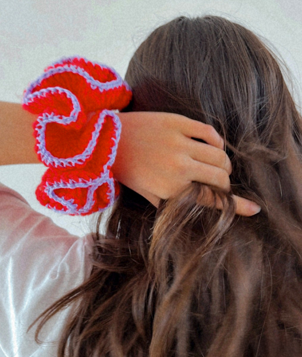
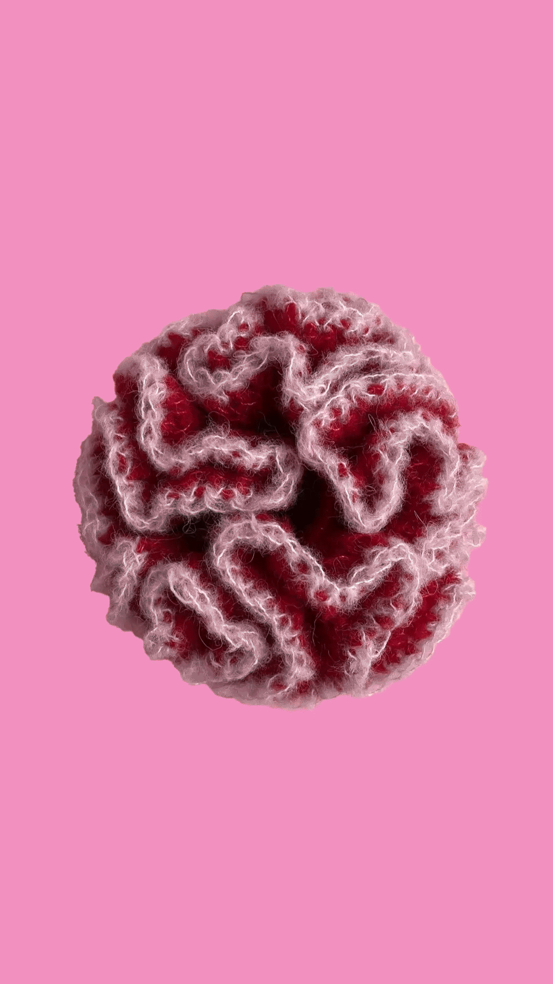
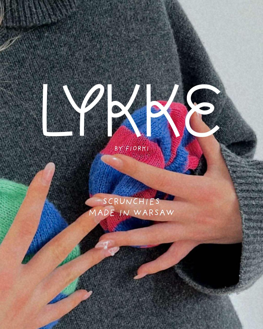
This project focused on building a bold and playful visual identity for a handmade brand based in Warsaw. Through expressive typography, vibrant color blocks, and product-focused compositions, the visuals highlight craftsmanship, individuality, and a confident, energetic attitude. The system was designed to work flexibly across social media and brand communication while keeping the products at the center.
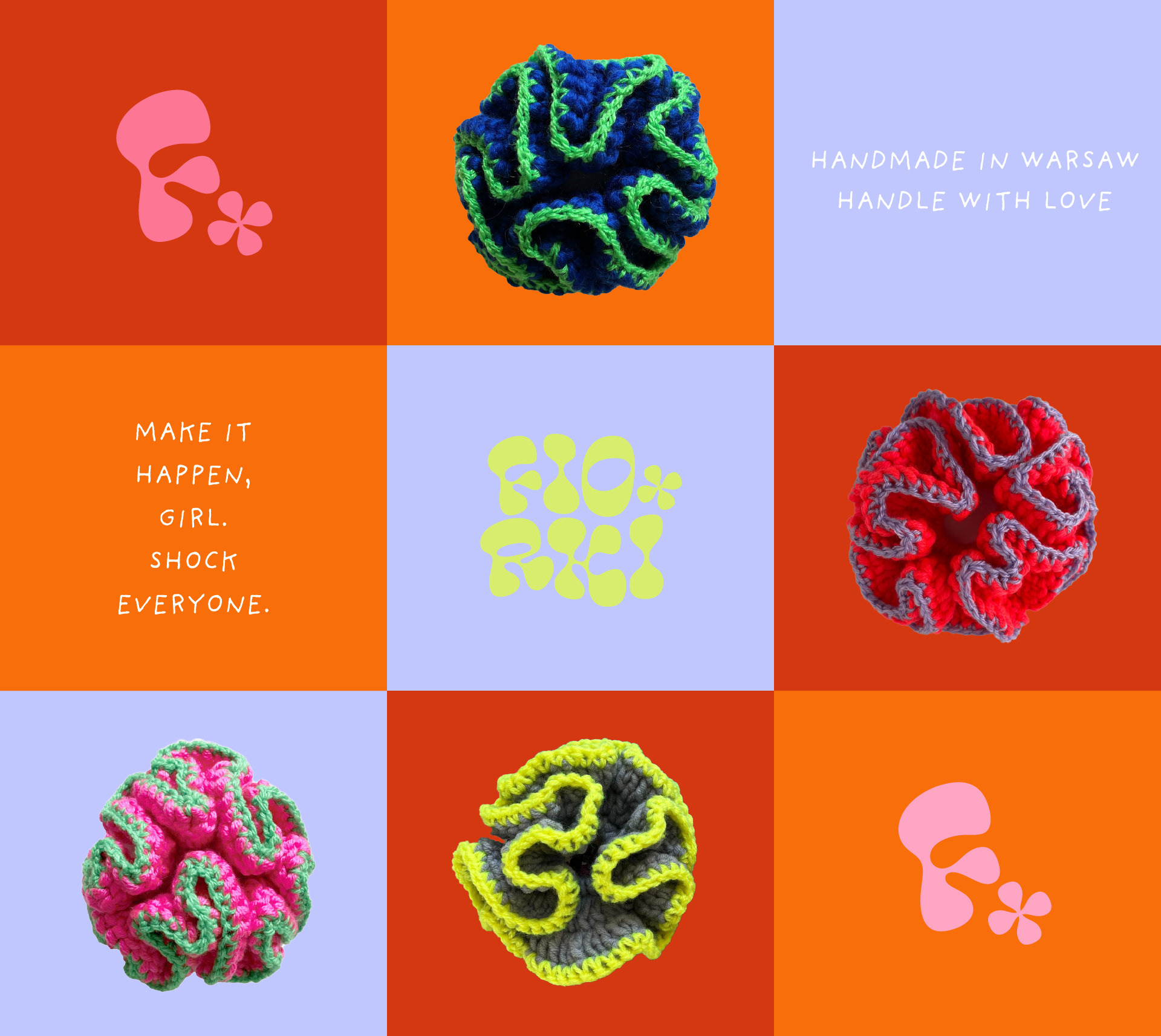

Logo concept
The logo was designed as a playful, organic mark inspired by a flower — a direct reference to the brand name Fiorki, which means “little flower” in Italian. Soft, rounded shapes and fluid forms reflect the handmade nature of the products and their expressive character.
The identity includes two logo versions: a full wordmark and a simplified symbol built around the letter F, allowing the brand to stay recognizable and flexible across different formats and platforms.
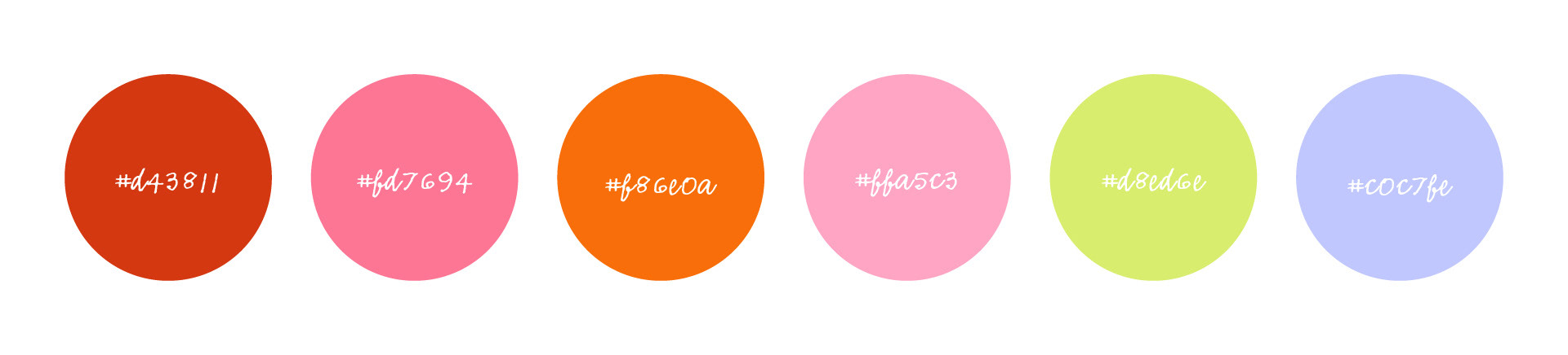
Core color palette
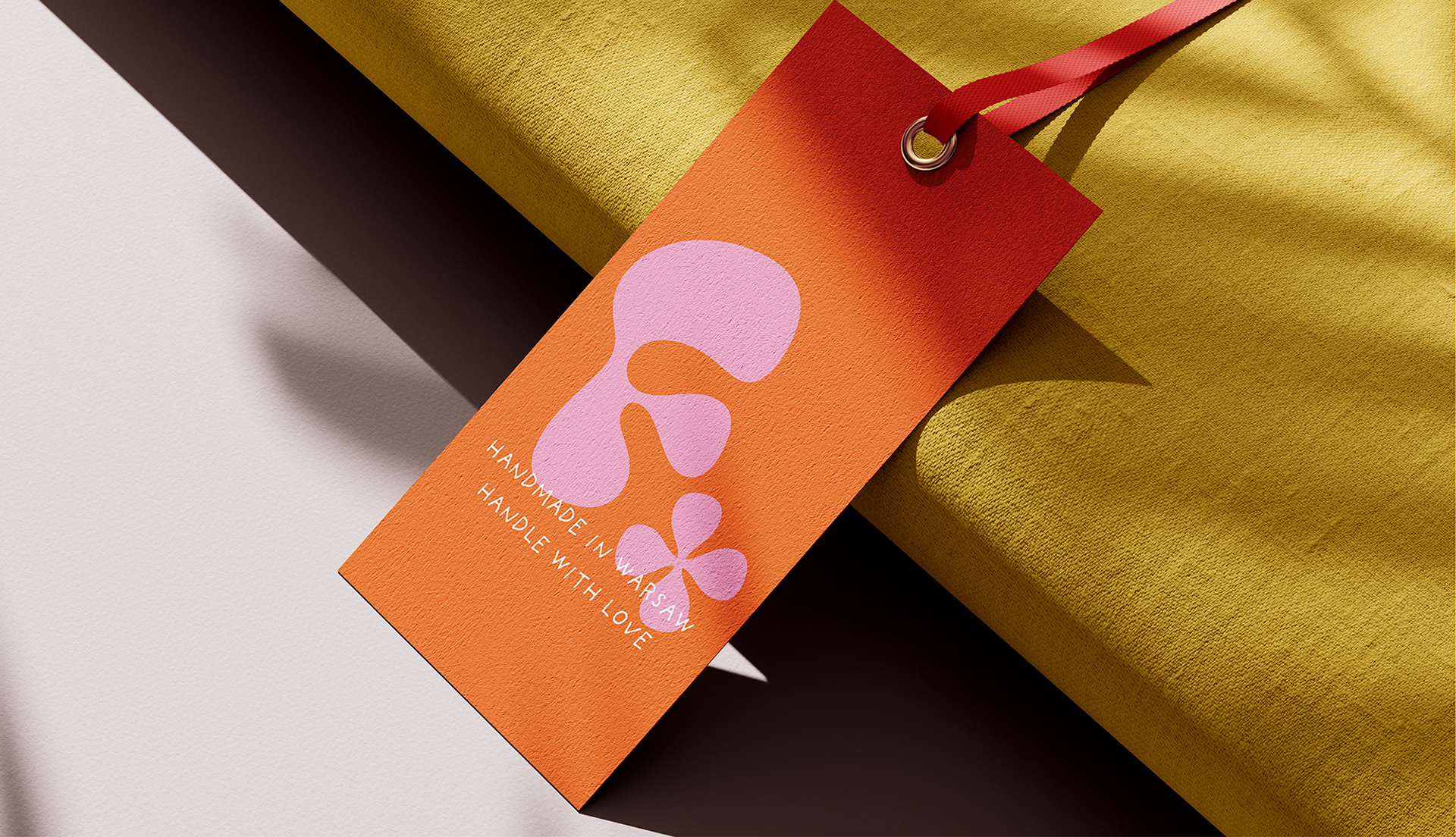
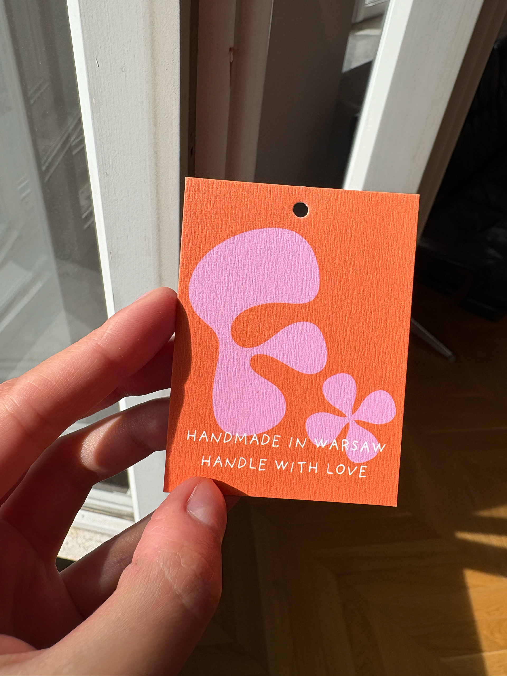
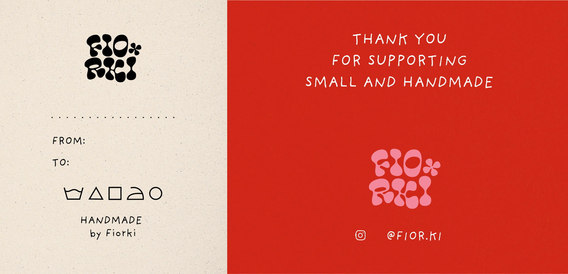
Packaging design. Printed tag, hang tag and thank-you card.
Social media visual language
The project results in a clear, scalable visual system that supports the brand across both digital and physical touchpoints.