Why
The owner of a Spanish and English language school reached out to me to redesign her website, which previously felt unclear, visually inconsistent, and not very encouraging for potential students. The main goal of the project was to improve clarity, usability, and overall approachability.
What
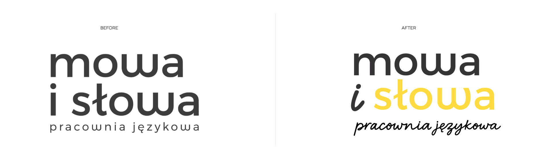
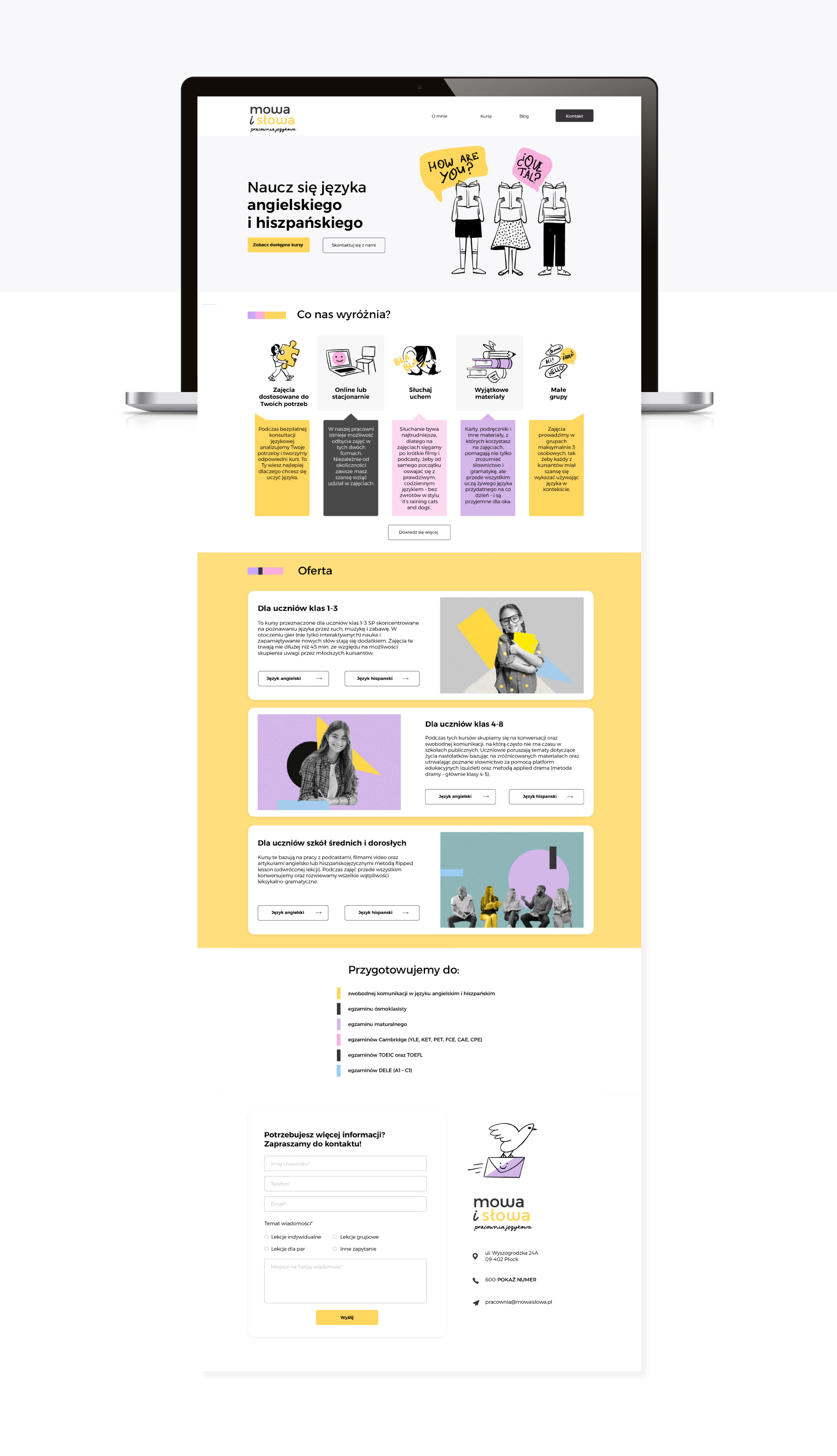
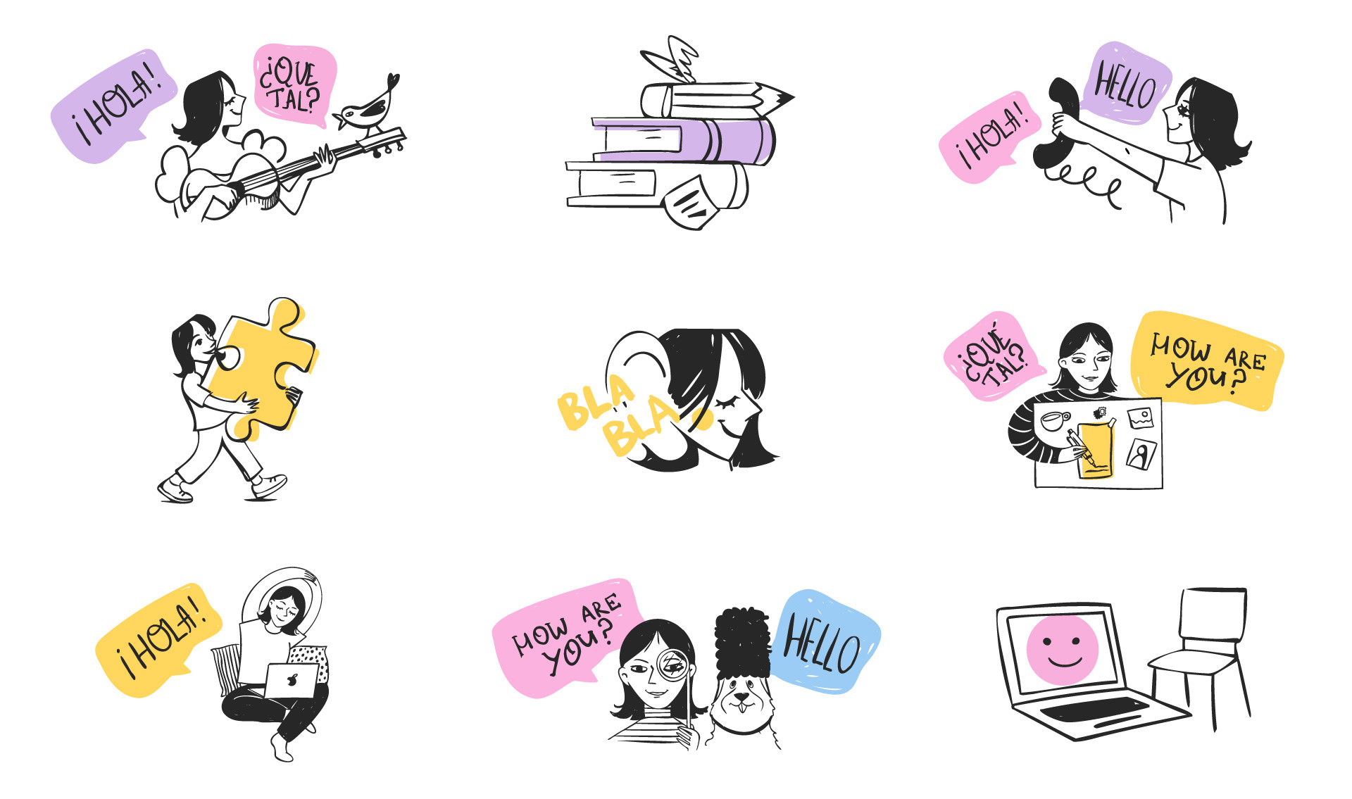
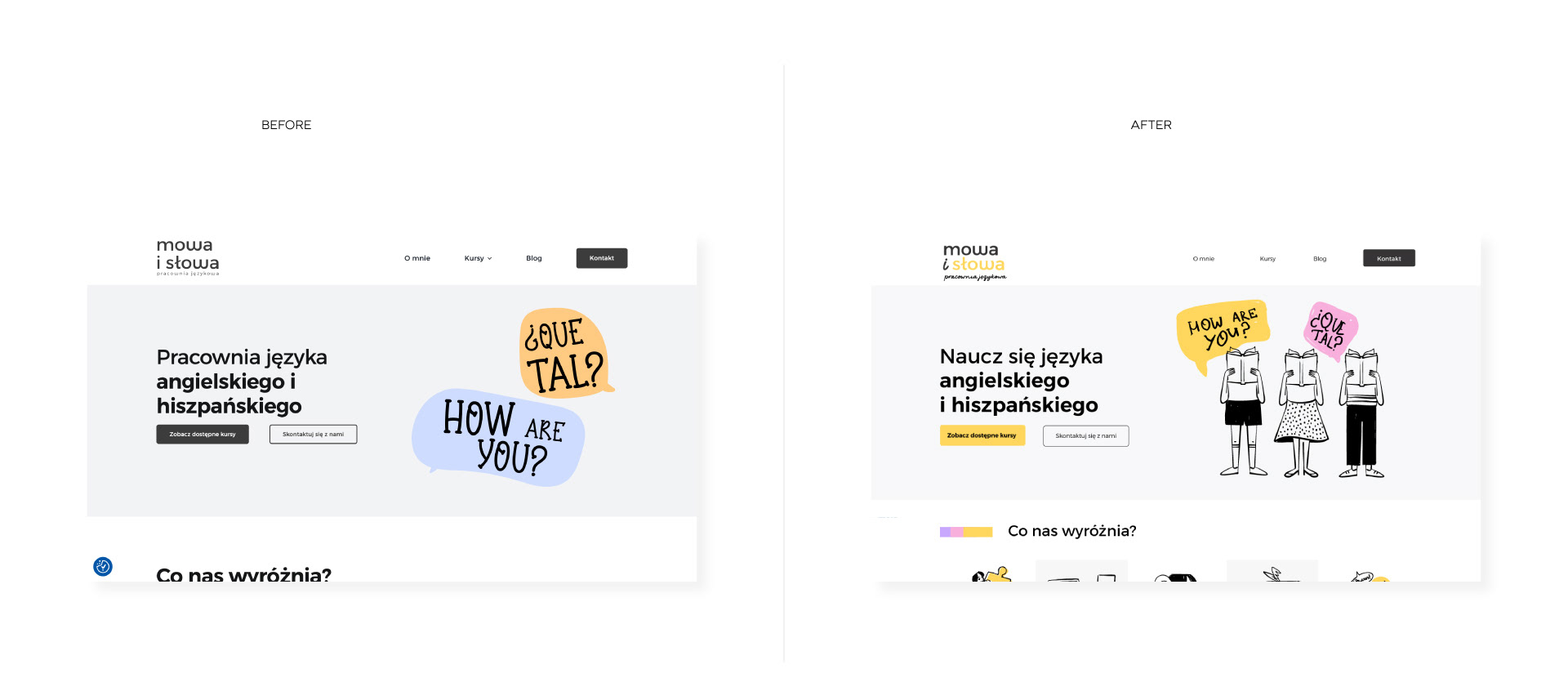
I redesigned the information architecture, visual language, and key sections of the site, focusing on clear communication of the offer, intuitive navigation, and a friendly, human-centred tone. I introduced a cohesive color palette, custom illustrations, and a clearer hierarchy to make the content easier to understand and more inviting.
The final result is a warm, accessible website that better reflects the school’s teaching philosophy, clearly presents the courses, and encourages users to explore the offer and get in touch.
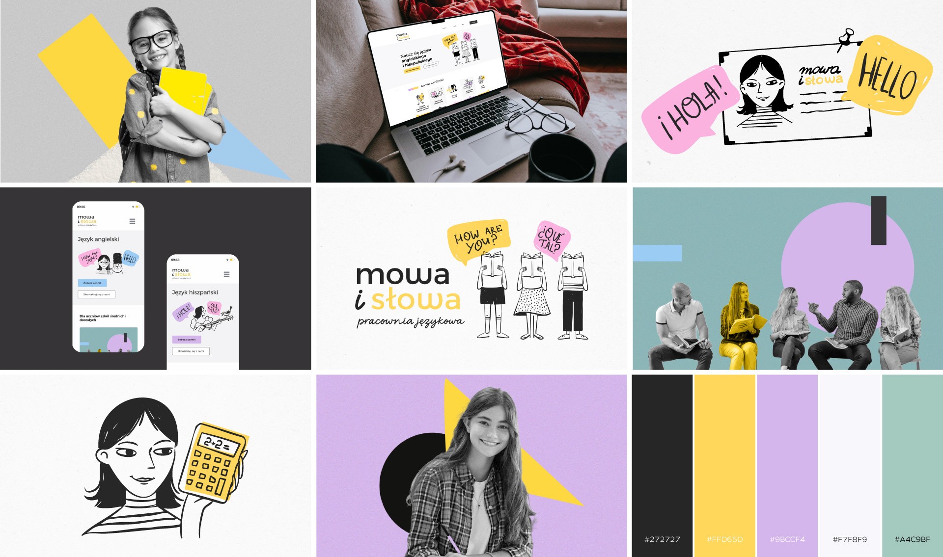
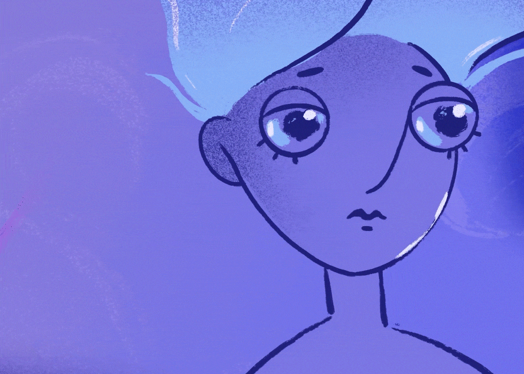
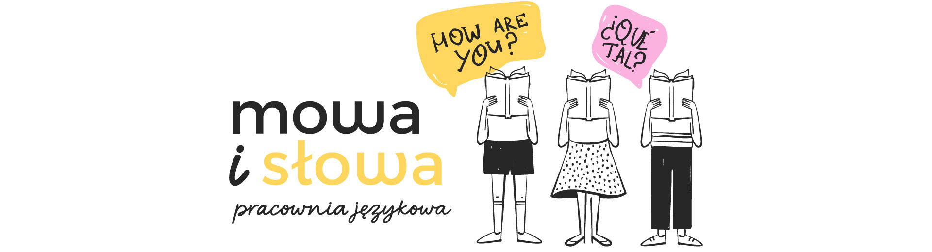
I created a main illustrated character representing the language school owner and teacher. The character became the face of the brand and appears across the website, helping to humanize the communication and make the learning experience feel more friendly and approachable.
The redesign significantly improved clarity, structure, and visual consistency across the website. The new layout, illustration system, and refined branding make the offer easier to understand, more approachable, and visually engaging.
Overall, the project transformed the website from a neutral, hard-to-read interface into a clear, friendly, and character-driven experience that better reflects the school’s teaching style and values.